Content
Designing your website is more fun when you are doing it with easy-to-use website builders like Weebly. With plenty of options to drag and drop along with tons of additional apps, themes, and Weebly templates, you can let your creativity go wild.
But no matter how creative you are with the design or how minimalist your approach is, some elements are a must for a successful homepage. These are the basics and pieces that make sure to provide a wholly online experience to visitors.
In this article, you will read about the 12 elements you should consider to add to your homepage and why they are necessary.
Headline
The first thing you need on your homepage is a clear and straightforward headline with absolutely no fluff. Something that grabs the reader’s attention instantly comforts them that they are at the right place.
You are expected to tell visitors within 3 seconds about what you are offering. You do it with the help of your homepage headline.
Make sure to keep the following in your mind when writing a headline:
- The headline must focus on the visitors. It should talk about them, not you.
- Make sure your headline is personal and connects with the reader.
- A good homepage headline is about three to eight words long.
- Make sure a sub-heading follows your headline.
- For SEO, using the keyword in the headline is a good idea.
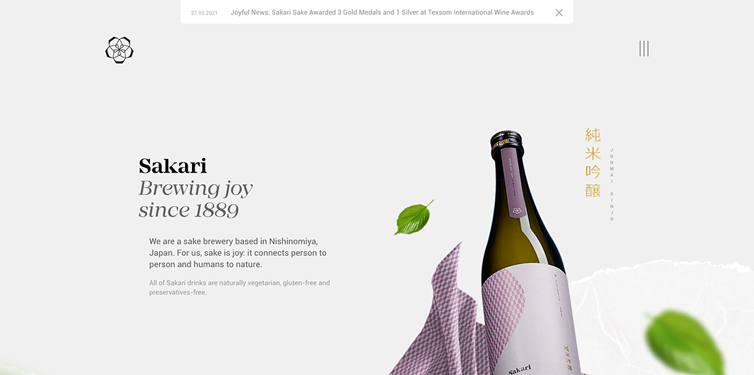
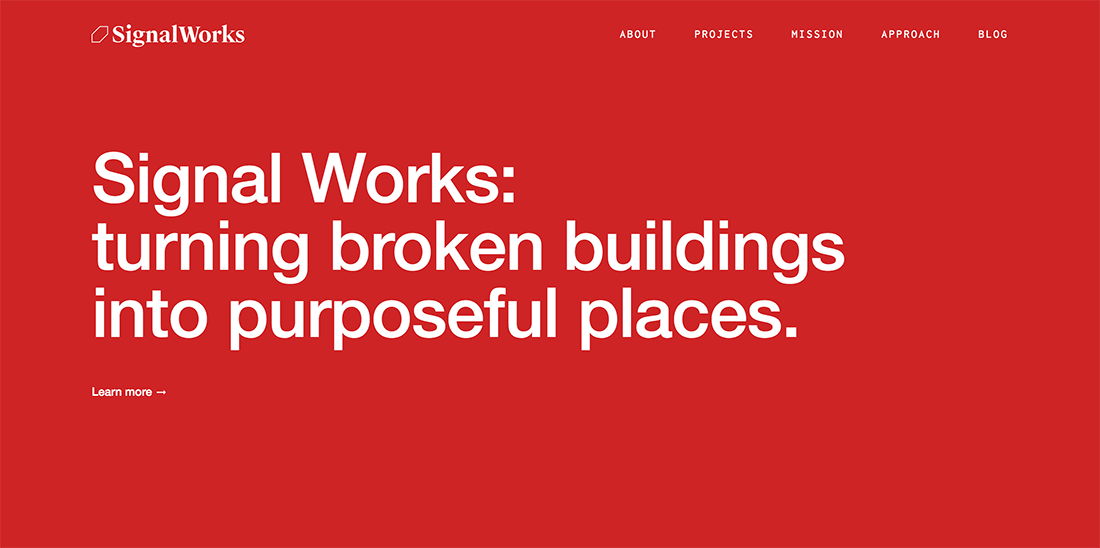
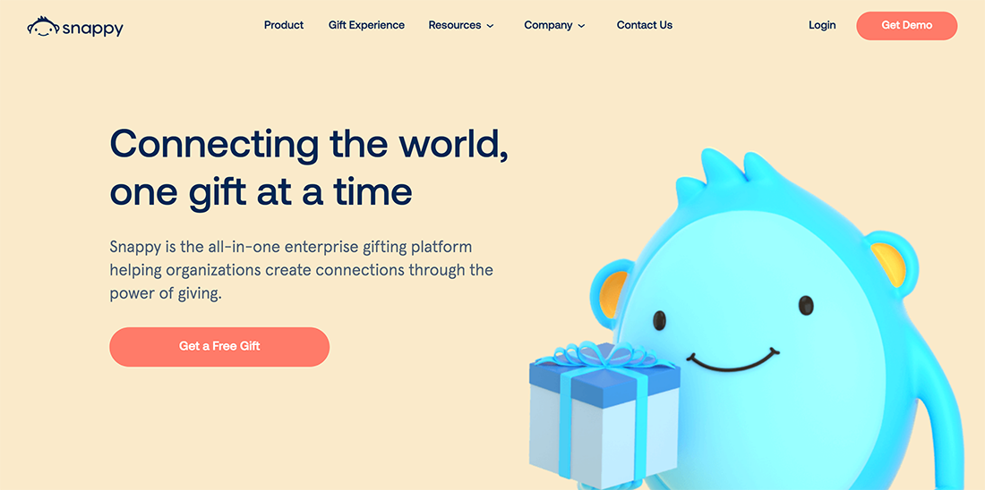
Here is an example of a website headline that I rate as an excellent one. Even though the headline is just four words, the headline and sub-heading copy is powerful, connect to the reader, and instantly offer the website’s purpose.
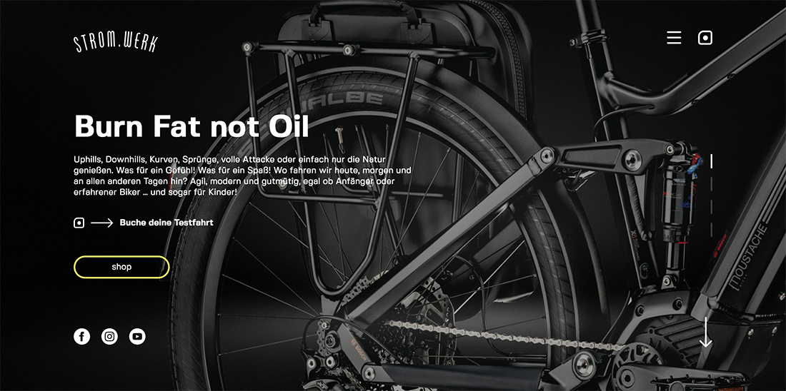
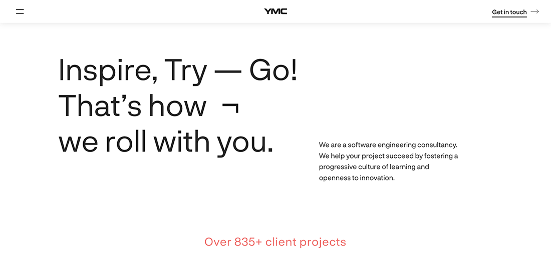
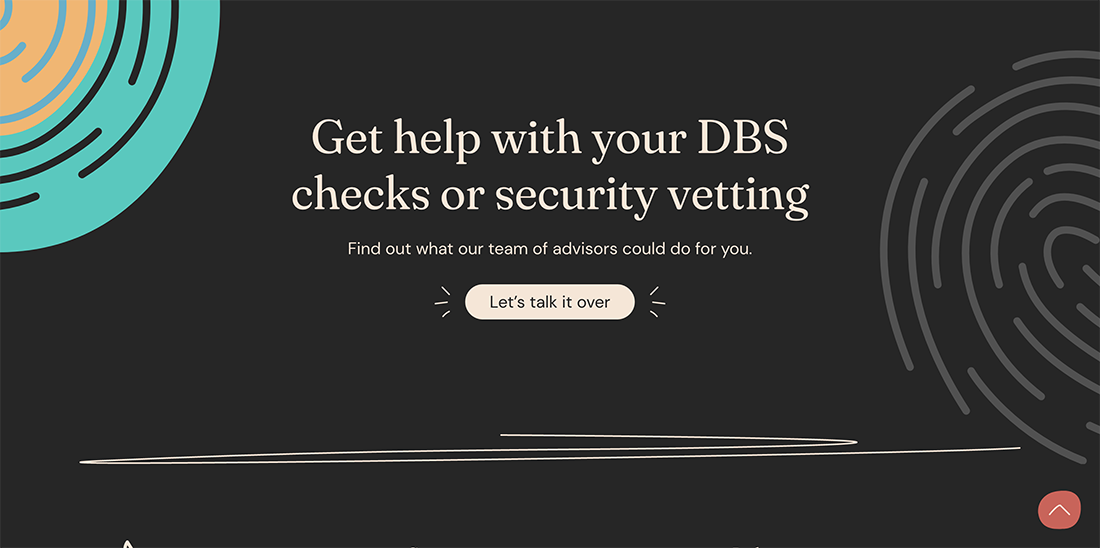
Another catchy headline title that prompts you to read ahead. It is also a great example of how to write a headline according to the audience demographic.
Hero Shot (Header image)
In the world of website design, a central image on the homepage header is called “Hero Shot” (or Header image). It is a great way to create an excellent first impression and to lower the bounce rate. It is the largest and most prominent element on your homepage.
A hero shot was an image that visually represents your business message or your offer. In most cases, it is placed right under the header, logo, and menu. The headline and sub-headline are commonly placed on the hero shot. So hero shot mostly plays a background role for a headline and sub-headline.
A good practice is avoiding stock images and getting your custom image, something more related to your business and products.
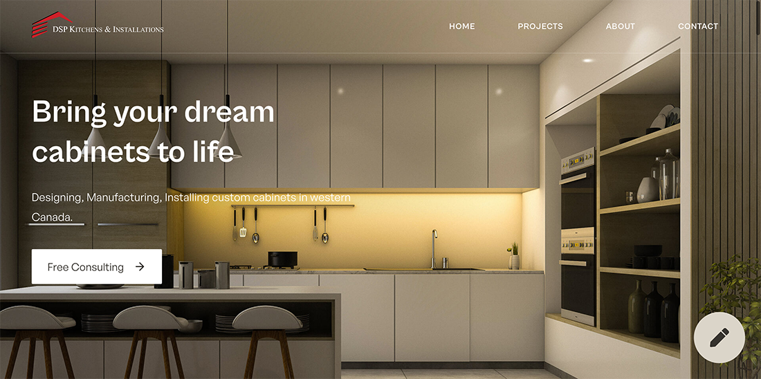
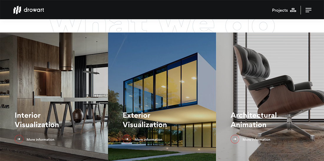
Here is an excellent example of a custom-made hero shot that reflects precisely what the business has to offer.
An Explainer Video
Sometimes the best medium to explain the value you offer isn’t texting at all. A short 1-3 minute explainer video can effectively engage your visitors and detail the services and benefit you offer.
The general rule of thumb for these kinds of videos is to keep them short and to have some fun.
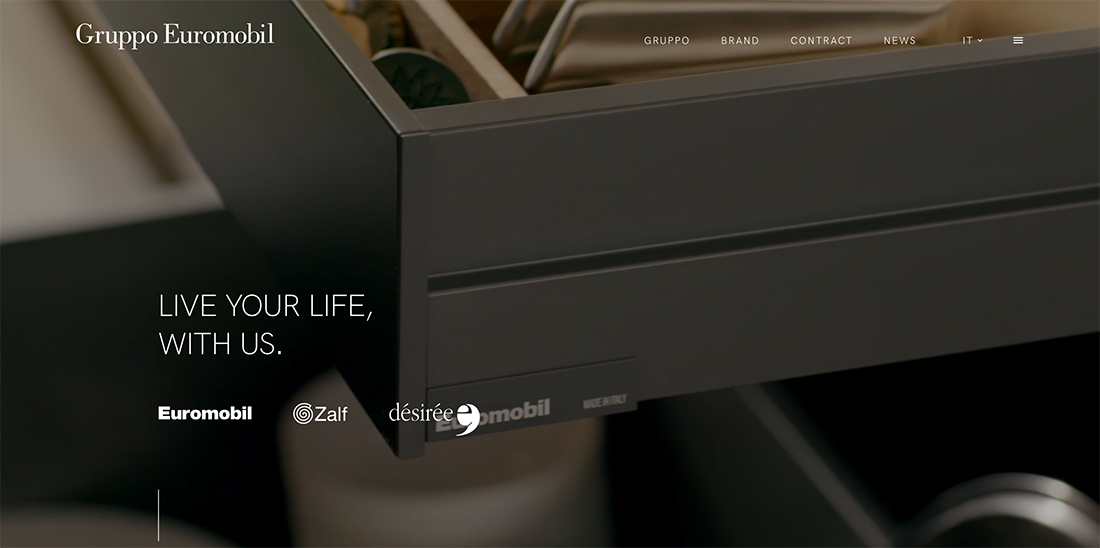
If done right, the explainer videos look stunning like
A clear explanation of what value you offer
In general, small business websites do an excellent job of telling people what they sell. But there’s more to it than that, and that’s where many sites run into trouble.
The point of the website isn’t just to explain what product or service you offer, but instead the value you offer. Why should people do business with you instead of the thousands of other choices out there?
I’m sure you’ve been on a site where you couldn’t exactly figure out what the company was selling and why you should buy it. It happens to me all the time.
Introduction
Don’t mix the introduction with the headline. The introduction is lengthier and introduces your business and services in detail.
A simple rule for writing an introductory copy is to write it in a conversational and friendly tone without any touch of corporation-style writing. And please, no self-praises.
What to avoid in an introduction?
- Self Praises.
- Me-Centric Text.
- Long and Boring Content.
- Content without Keywords.
- Content Placed at the Bottom.
What to include in an introduction?
- Friendly, informative, and conversational style.
- Make it more about the Visitors.
- Short and Concise but clear.
- Viewable Without Scrolling Down.
- Keywords, links, headings, etc.
Here is an excellent example of an intelligent introduction.
Benefits and Other Content Blocks
The use of content blocks is a trending design technique as it also looks good on mobile devices.
Most Weebly designers use these content blocks for the benefits they offer, introduction to their services, offers they have, etc. In simple words, you can add anything that you feel is worthy for your visitors.
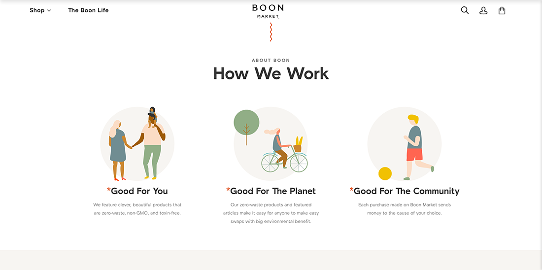
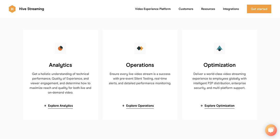
Here are some examples of websites using content blocks that look good on both desktop and mobile devices.
CTA (Call to Action)
The homepage is often the most visited page unless you are using a different landing page for a PPC campaign. This makes it mandatory for designers to place their primary CTA or multiple secondary call-to-action on the homepage.
It doesn’t matter what the CTA is, as long as it directly feeds into the goal of your site. Maybe you want people to sign up for your email newsletter or pick up the phone and call you.
But whatever it is, don’t make your visitors guess; spell it out and make it evident and straightforward.
One of the most common practices is to place the essential CTA on a hero shot along with headline and sub-headline. The primary CTA is mainly designed as a button and visible without scrolling.
Placing CTAs above the fold is important because that area of a page gets the most views. However, there are still other areas of a page to promote your CTAs. Add some at the bottom of pages and within body content as well.
Listed are some tips to get the most out of your CTAs:
- Make the CTA copy personalized. Please don’t make it generic like purchase now, buy now, click here, etc. In one case, when “37 Signals” changed their CTA text to “See Plans and Pricing” instead of “click here,” their conversion rates increased to 200%.
- According to another research conducted by HubSpot, personalized CTA converts 42% better. Make sure the first word of your CTA copy is an actionable verb.
- Turn call-to-action into call-to-value by emphasizing the value you offer.
- Choose the color of the CTA button according to the demographic you are targeting and the goal of your CTA.
- The rounded CTA buttons work better than other shapes, while the moderate size also performs better than too large or too small sizes. Bigger is not always a good option. You have to run tests before settling with the most conversion optimized size, color, text, and CTA placement.
- Make them more prominent and bolder than most other elements on the page, but don’t overdo it.
- Consider colors of the CTA, whether it is a link, button, or image. Make them look good, so good people will want to click on them.
- Less is more. Please keep it simple and clear what is being offered.
Portfolio
Probably not for everyone, especially if you are a startup, but presenting your portfolio on your homepage is a great way to increase your conversion.
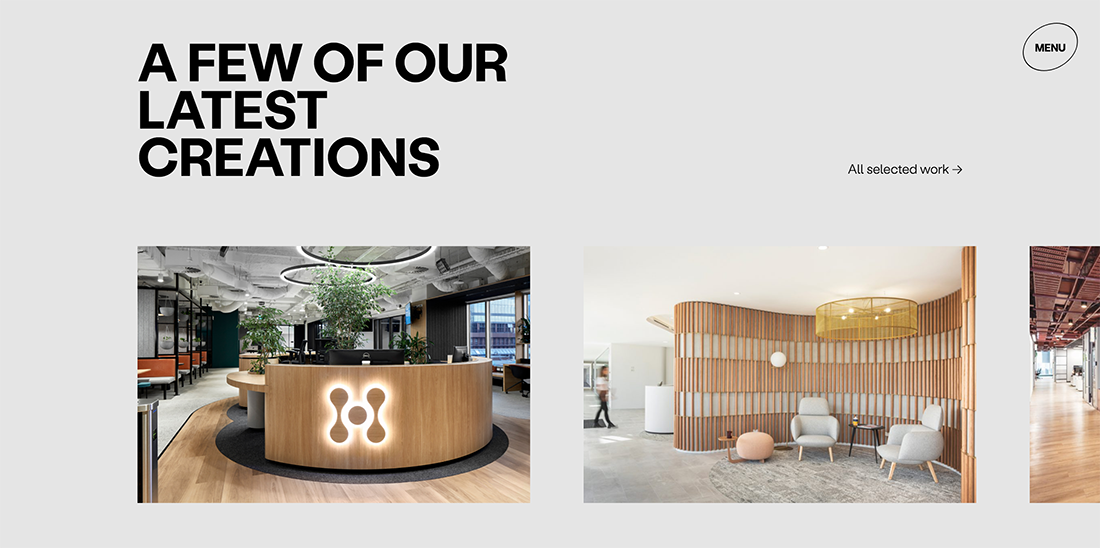
Businesses are getting creative with showcasing their portfolios. Use images, descriptions, links, and even case studies to let visitors learn about your products/services.
Make sure to maintain your portfolio. This is one of the common mistakes by design owners as they forget about it after the initial design. Make sure you are constantly updating all the latest projects in your portfolio.
Testimonials and Social Proof
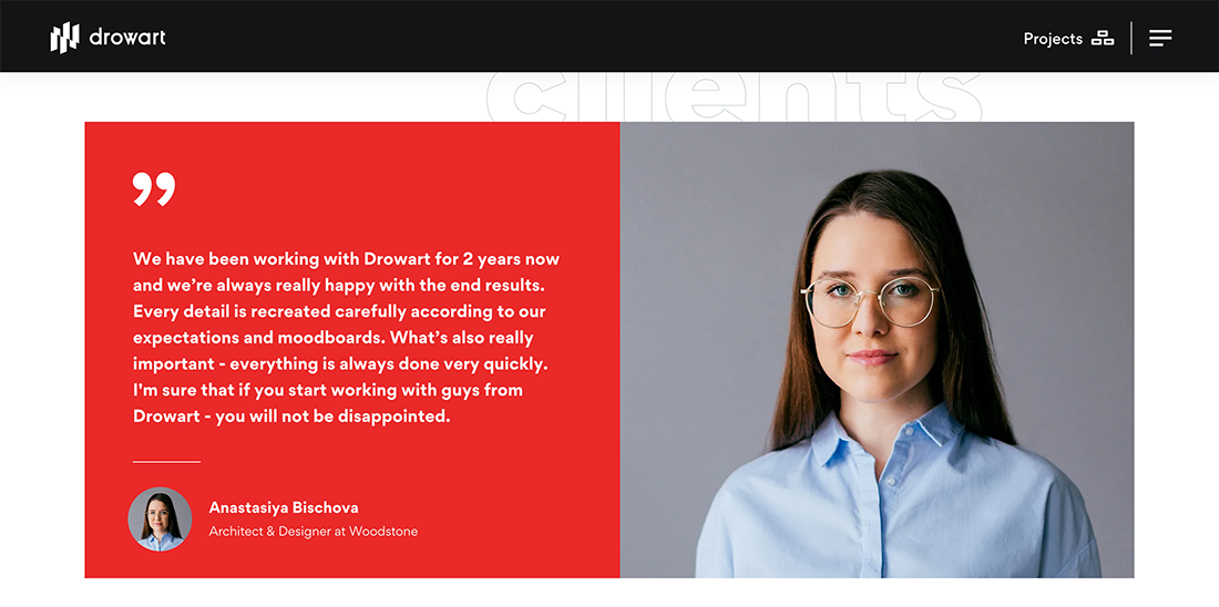
Adding testimonials or other forms of social proof to your website is trending and very effective in conversion rate.
Research, studies, and even psychology experts all point in one direction, favorable opinion of other users about your business is the best way to persuade visitors to buy.
One survey concludes that online reviews influence 90% of customers. In contrast, another study claim 63% of customers are more likely to purchase from a website with customer testimonials.
We have already shared a detailed blog post about the best testimonial practices for business Weebly websites. Make sure to read it if you add testimonials to your homepage or get inspired by the fantastic testimonial designs you can create with the Baamboo Studio testimonial app.
Quick Checklist for Adding Testimonials to Homepage
- With each testimonial, add the person’s name, image, company name, and a link to social media account or website.
- The content of the testimonial must motivate readers.
- Using testimonial slider to adjust more testimonials within the limited real space available on the homepage.
- Add video testimonials when available.
- Don’t try to edit the testimonials to add more formatting or to correct grammar.
Other than testimonials, you can also use other social poof options on the homepage. The more, the better, but don’t make your website crowded. You can also add the following types of social proof:
- Awards.
- Trust certifications.
- Online reviews (If the business is rated positively on third-party review websites, make sure to add it on your homepage).
- Press mentions.
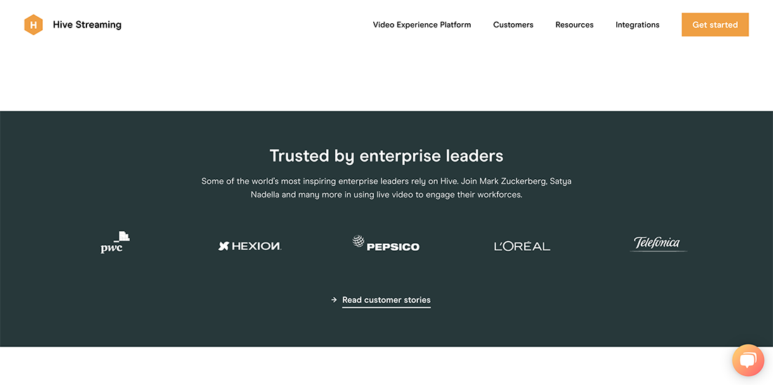
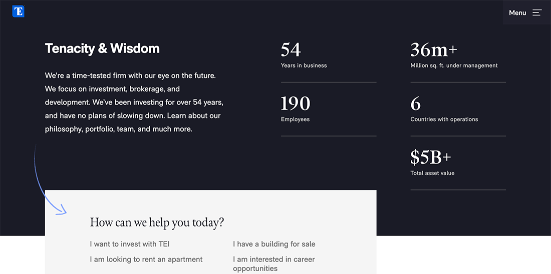
- Statistics like sales growth, the number of subscribers, followers on social media, rankings, etc.
- Client logos.
Tips to maximize testimonials:
Try to include real names and titles and use pictures of the person along with their testimonial if possible (if they already have a picture on LinkedIn, ask to use that!). This adds authenticity. Not including a name makes a testimonial seem phony, even if it’s real.
Instead of randomly placing testimonials on any page, consider putting them on specific topics on the pages relevant to them. For example, if you have a quote about your terrific customer service, place that on a service or support page.
Blog
If you are featuring a high-quality blog, make sure the homepage also introduces your blog and directs visitors who want to read more.
Other than SEO benefits, the blog also increases engagement and subscriptions.
A well-established technique is to use a headline slider with Hero Shot in the background and one blog introduction slide. You can also place a blog post digest on your homepage.
Another good practice is to provide links to your most popular blog posts.
Subscription Invitation and Lead Magnets
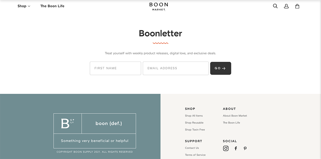
For a business, an email list is often rated as the best marketing tool for higher conversion. The best way to create your email list with a reasonable click-through rate is to collect emails from your website through a subscription form.
The best way to get more subscribers is to offer the best value to them in return. A prevalent practice is offering content like weekly blog posts, weekly newsletters, cheat sheets, ebooks, case studies, etc.
By making clear and prominent offers, websites can also generate new leads and increase their conversions. Such offers are commonly known as “lead magnets” by web designers.
So what includes in a lead magnet
- Free Trials. (Netflix)
- Free Downloads. (Mint)
- Discounts.
- Anything that offers value to users.
The next question is – where to place your offer on the homepage?
If the offer has great value for your users, include it on your hero shot or make it a pop-up ad.
Other ways to add “offer” to your homepage are adding your footer, header, banner as a window in the sidebar or a row.
Contact Information
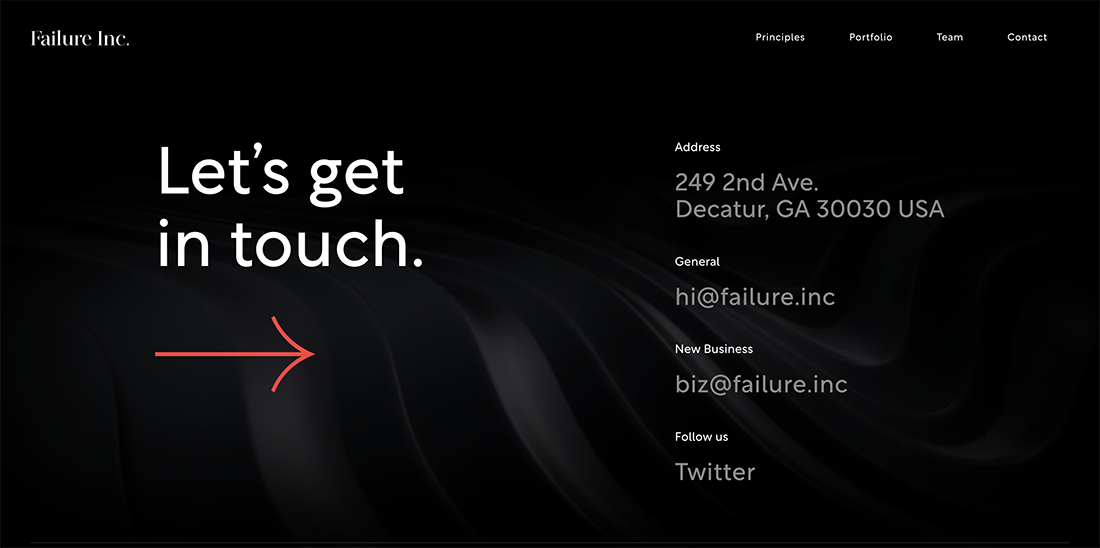
Yes, you might have a separate contact page with all details about your contact information. Still, it is a good idea to add brief contact information on your homepage for visitors who want to scan your website.
If someone wants to contact you, make sure the user can do that while staying on the homepage. A common practice is to add contact information in the footer. You can add an email address, mailing address, and phone contact.
Easily accessible contact information also adds credibility and comforts users.
Conclusion
There is a difference between a homepage and a winning homepage. By implementing our suggestions and ideas into your homepage design, you can easily create a Weebly website with an endearing and inspiring homepage.
The good thing for Weebly users is they can have most of these features on the Weebly websites templates. You can also explore tons of other eye-catching Weebly templates with almost everything listed in this article on Baamboo Studio.
Feel free to let us know your thoughts about the essential design elements for a homepage in the comments below.






0 Comments